Case Study
Yard Dental Clinic
クリニックサイト|Clinic Website
印象の刷新:医療の場を、「日常の庭」へ。
Refreshing the impression: turning a place of medicine into an "everyday garden."

背景と課題
愛知県半田市に開業する歯科医院。一般的に「歯科医院」という場所には、「痛い・怖い・無機質」といったネガティブな記号が付随します。クライアントはそうした固定観念を払拭し、地域の人々の生活の一部となるような、心地よく開かれた場所を目指していました。
Context
A dental clinic opening in Handa, Aichi. A dental clinic usually carries negative associations—painful, scary, sterile. The client wanted to dispel those preconceptions and become a comfortable, open place that is part of local people's daily lives.
解決のアプローチ
Webサイトにおける情報の優先順位を、医療的な「機能性」よりも、生活者にとっての「居心地」へと大胆に振り切りました。心理的なハードルを極限まで下げることで、「治療が必要な時」だけでなく、「暮らしの一部」として選ばれるブランドイメージの定着を図っています。
Core Approach
We boldly shifted the website's priorities from medical "functionality" to "comfort" for the people who use it. By lowering the psychological barrier as far as possible, we aimed to establish a brand image chosen not only "when treatment is needed" but as "part of everyday life."
空気感への翻訳
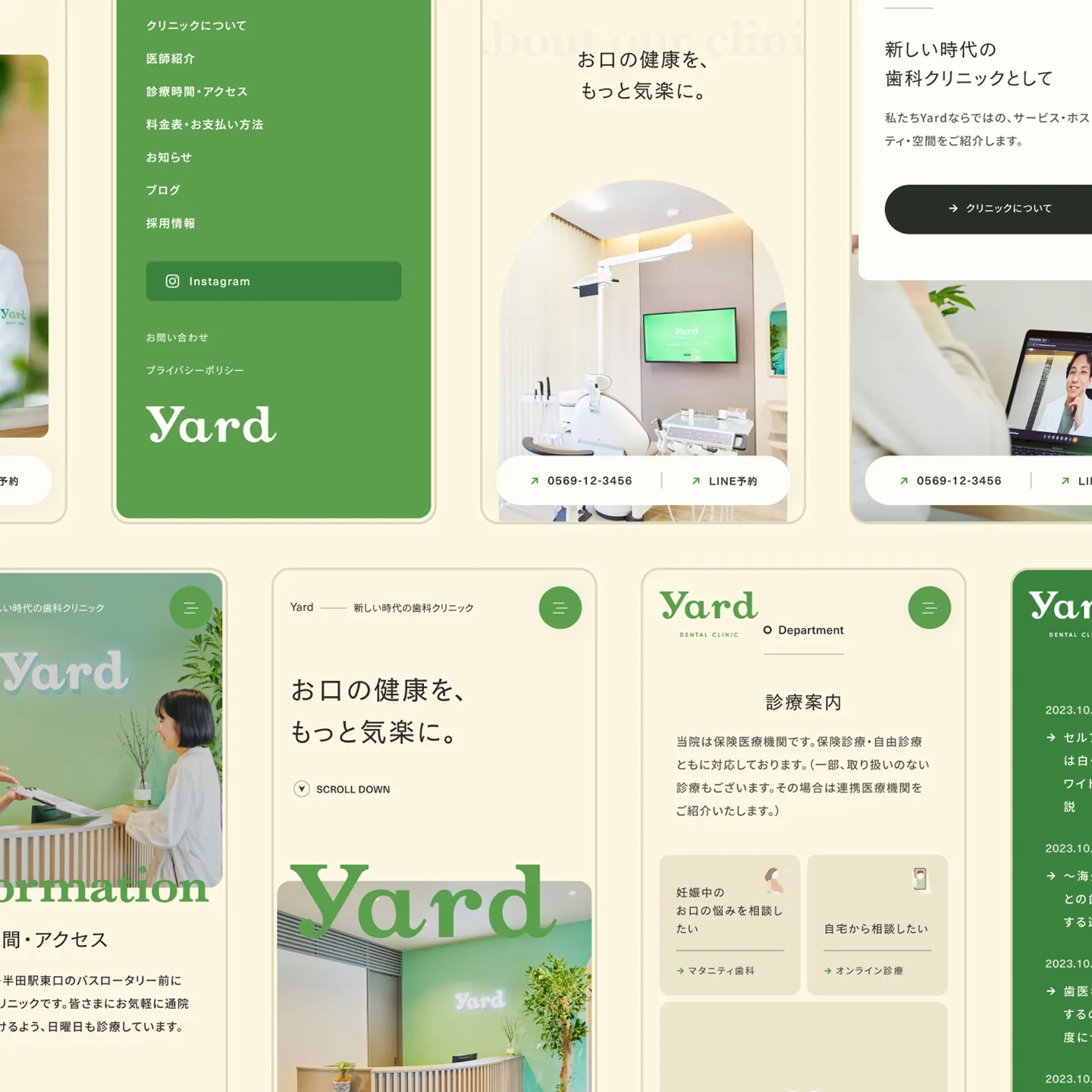
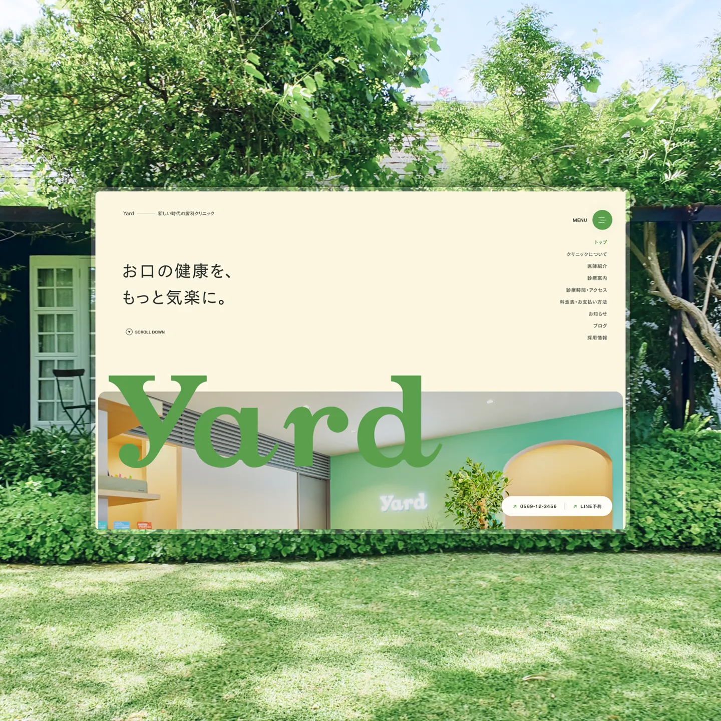
治療の場を「日常の庭(Yard)」と解釈し、そこに流れる空気をデザインしました。Webデザインのみならず、現地の光や緑の気配を捉えるフォトディレクションから担当。無機質さを排した柔らかなトーン&マナーで統一することで、医療機関としての信頼性と、生活の延長にある場所のような穏やかな居心地を同居させています。
Translation into Atmosphere
We interpreted the place of treatment as an "everyday garden (Yard)" and designed the atmosphere that flows through it. Beyond the web design, we took charge from the photo direction, capturing the local light and the presence of greenery. A soft tone and manner free of sterility brings together the trustworthiness of a medical institution and the calm comfort of a place that feels like an extension of daily life.
接点への翻訳
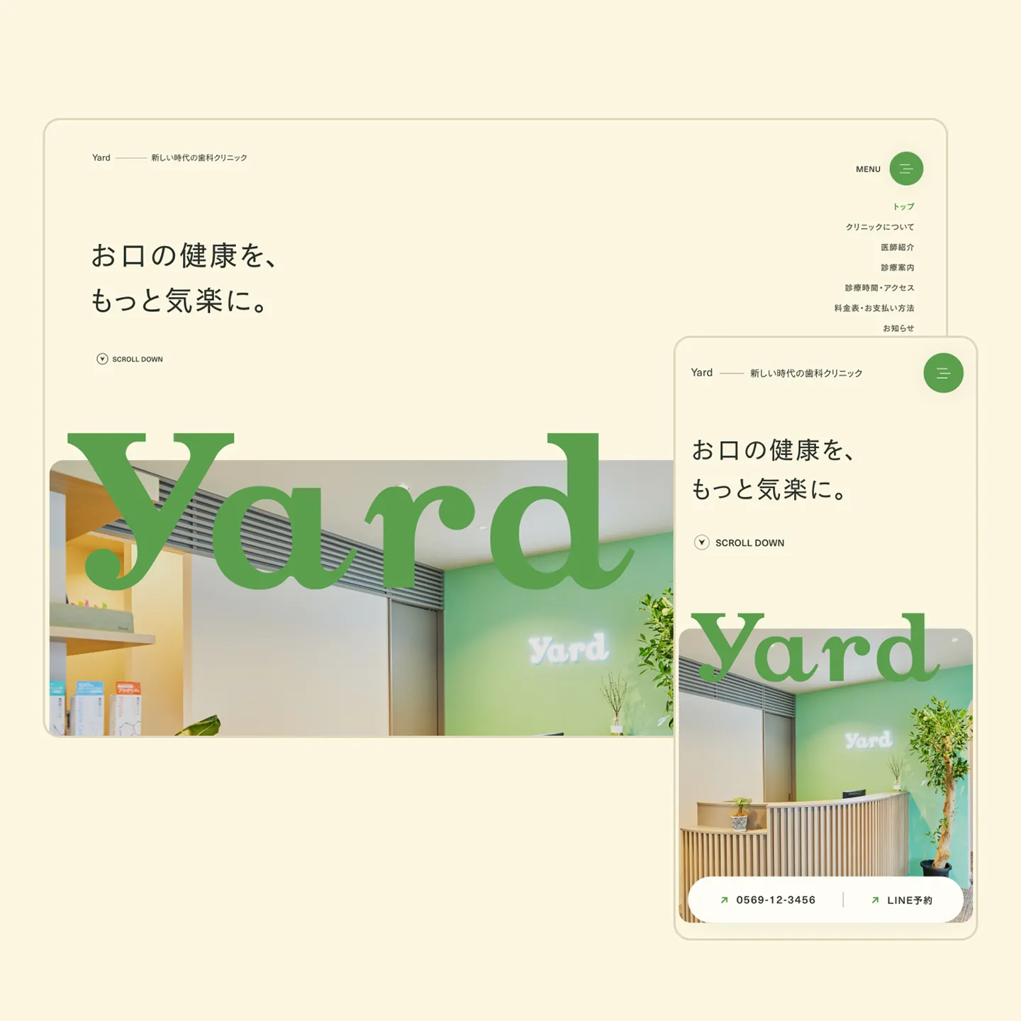
色彩やタイポグラフィ、ボタン形状に至るまで、威圧感を排除した丸みのあるトーンを採用しました。Webサイトを「現地の空気を映す窓」と捉え、そこに流れる穏やかな時間や体温をUIに定着させています。また、いつでも足を運べる「庭」としての機能を意識し、日常の中で最も接触頻度の高いモバイルでの体験・印象を緻密にコントロールしました。
Translation into Interface
From color and typography down to the shape of the buttons, we adopted a rounded tone that removes any sense of intimidation. Treating the website as a "window that reflects the local atmosphere," we carried the calm flow of time and the warmth of the place into the UI. Mindful of its role as a "garden" people can visit at any time, we carefully controlled the experience and impression on mobile, the device people touch most often in daily life.