Case Study
STORY&Co.
コーポレートサイト|Corporate Website
構造の整理:複雑な事業構造を、秩序ある「器」へ。
Organizing structure: turning a complex business structure into an orderly "vessel."

背景と課題
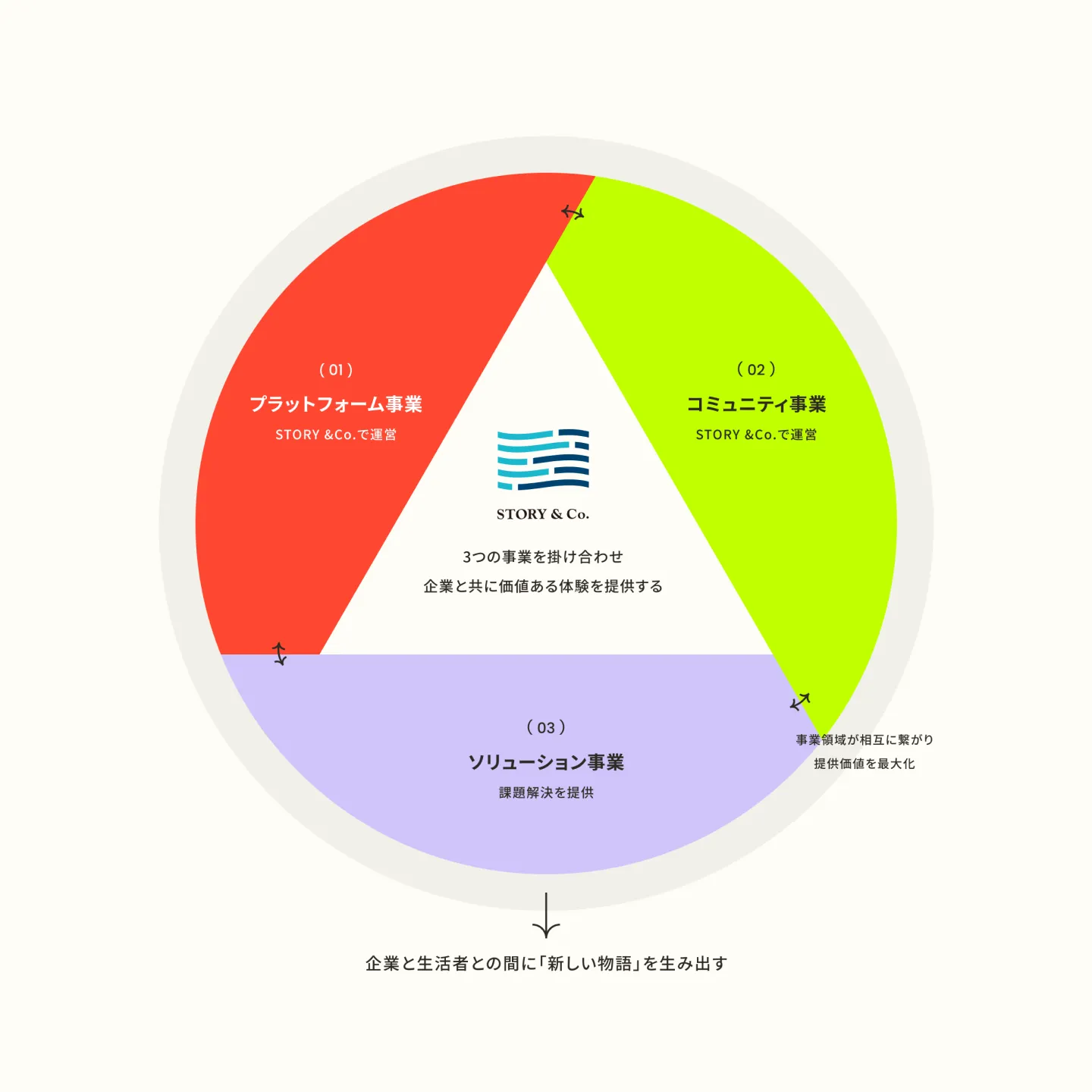
コミュニティ運営、システム開発、イベントプロデュース、アパレルなど、多岐にわたる事業を展開する同社。非常に多面的な魅力を持つ一方で、情報の粒度が揃わず、外部からは「何をしている会社か」が一言で伝わりづらいという課題がありました。事業間のシナジーや、企業としての全体像(人格)が見えにくく、活動のエネルギーが分散して見えてしまう状況でした。
Context
The company runs a wide range of businesses, from community management and system development to event production and apparel. While this gave it many facets, its information varied in granularity, and from the outside it was hard to say in a word what the company actually does. The synergy between its businesses and its overall picture as a company—its personality—were difficult to see, so its energy appeared scattered.
解決のアプローチ
複雑さを「削ぎ落とす」のではなく、あえて「秩序立てて見せる」ことで企業の知性として変換しました。説明的な言葉に頼らず、視覚的な構造そのもので事業シナジーを感じさせ、ステークホルダーへの信頼形成を促すアプローチをとっています。
Core Approach
Rather than stripping the complexity away, we chose to present it in an orderly way, turning it into an expression of the company's intelligence. Instead of relying on explanatory words, the visual structure itself conveys the synergy between the businesses and helps build trust with stakeholders.
構造への翻訳
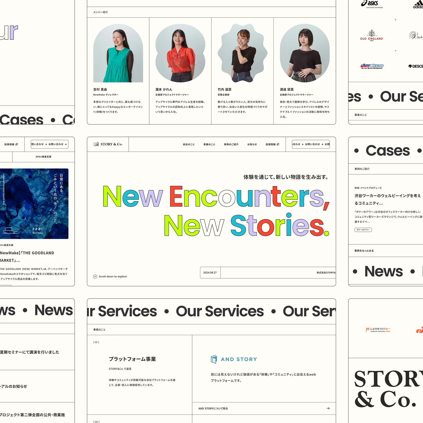
複雑に絡み合う事業構造を因数分解し、すべての活動を等価に扱うための「情報の規格化」を行いました。異なる性質を持つ多様な事業やニュースを、共通のルール(モジュール)の中に流し込むことでノイズを排除。「多角的な事業」という複雑さを、「整然とした豊かさ」へと変換し、一つの強い人格(ブランド)として統合されるよう再構築しています。
Translation into Structure
We broke down the intricately interwoven business structure and standardized the information so that every activity could be treated equally. Businesses and news items of different natures flow into a shared set of rules (modules), which removes noise. The complexity of a "multifaceted business" was transformed into "orderly richness," and the whole was rebuilt to come together as one strong personality—a brand.
視覚への翻訳
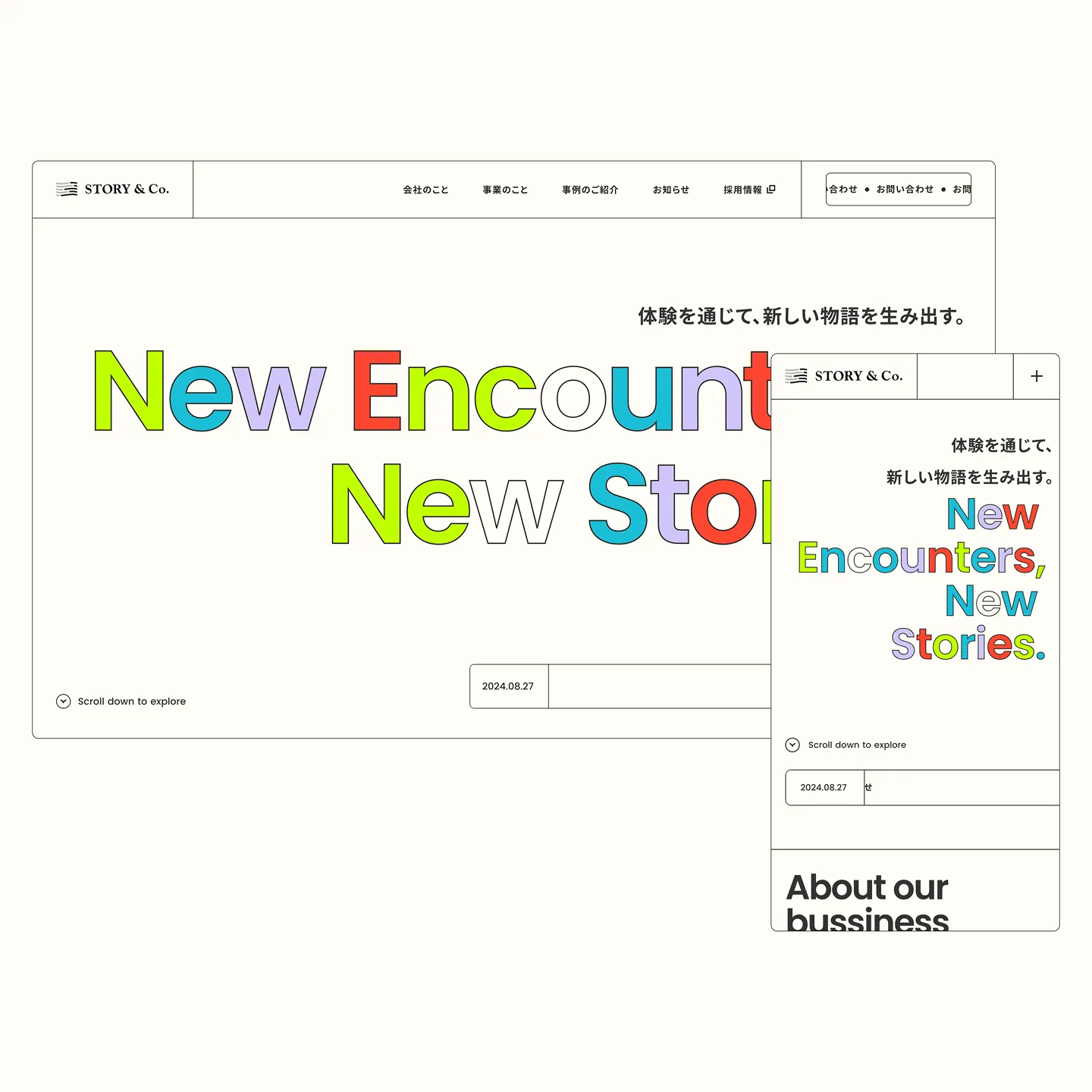
情報構造の最適化という「機能性」を担保しつつ、企業が持つ活発で人間味のある「人格」をいかに同居させるか。グリッドシステムによる構造美を最大限に活かしながら、エディトリアルデザインを意識した大胆なレイアウトやラベリングを採用。整理された情報の隙間から、企業の持つポジティブな熱量が視覚的に伝わるよう設計しました。
Translation into Visual
How do you secure the functionality of an optimized information structure while letting the company's lively, human personality live alongside it? We made the most of the structural beauty of a grid system while adopting bold layouts and labeling inspired by editorial design. Through the gaps in the organized information, the company's positive energy comes across visually.